
A History of Modern Graffiti Typefaces - Part 2 of 6
by: Raseone - Updated 04/28/2024
Graffiti Lettering in Modern Art & Design
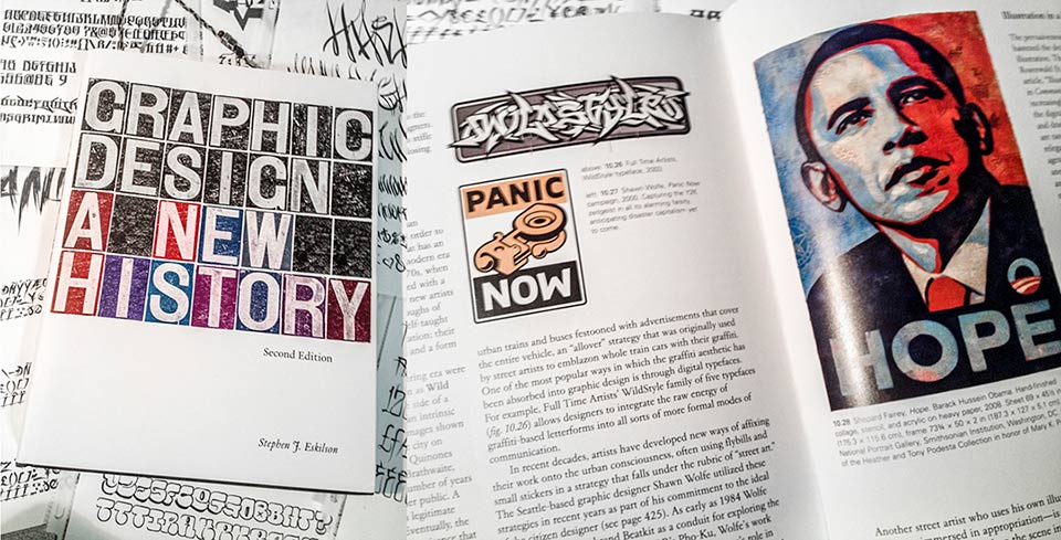
The Yale University Press texbook entitled "Graphic Design A New History" explores the influence of graffiti art on modern commercial art, focusing on graffiti style typefaces & featuring the Wildstyle™ type family from the Graffiti Fonts® foundry. The 2019 edition contains somewhat expanded information on the subject.
Modern Graffiti art is so vast & varied in it's applications, mediums, content & styles that it can be nearly impossible to define or classify within more traditional art & design concepts. In the 2012 Yale University textbook entitled "Graphic Design A Modern History" author Stephen J Eskilson credits graffiti art as being among the strongest influences on modern design trends featuring the WildStyle® font family by Raseone alongside the iconic Obama HOPE poster by Shepard Fairey & Shawn Wolfes 1999 Remover Installer as examples of graffiti's widely varied penetration into contemporary art, commercial graphic design & as the author puts it: "more formal modes of communication".
With applications across virtually any & all media, mediums & material the skill set of the modern graffiti artist often spans multiple disciplines. Even so, in the world of digital typefaces & typography, graffiti lettering was conspicuously late to the table. It was however only a matter of time until artists who grew up in the age Hip-Hop & graffiti art, desktop publishing & omnipresent computers & eventually the internet, would combine those elements and fill this void. Traditional elements of graffiti lettering such as wildstyles, handstyles, throw ups & blocks as well as traditional (if not unique) graffiti treatments such as outlines, 3D, detailed fills, drips, splatters, strokes, distressing etc. would soon start to appear within and influence these more formal, commercial & mechanical aspects of design & communication. The visual essence of graffiti, drips, overspray, spatter, the distinctive, hollow strokes of fatcaps and the streaks of markers would all be heavily utilized in major media as design trends repeatedly turned back to graffiti over the 80's, 90s and 2000s. By this time the now highly developed artistry of graffiti lettering had established it's own traditional motifs, developing not only variations & combinations of preexisting concepts in lettering but also spawning & propagating a gigantic wealth of new & unique techniques, styles & morphologies, pushing the bounderies of lettering & eventually even type.
The Graffiti Phenomenon as the Subject of Media
The early cultural phenomenon of graffiti on the streets and subway trains of American urban centers was massive. The ubiquitous proliferation of cryptic names, words & phrases covering every surface was a strange, new development. This simple, novel mischief had evolved into a complex subculture and art form very rapidly and had received tons of media attention in the process. Print and broadcast media from the late 1960's through the early 80's brought world-wide attention to the phenomenon frequently in the early years. It would have been difficult not to. While the attention was largely negative, the art and artists did actually receive quite a bit of sympathetic coverage, helping to launch careers and gain lasting notoriety for many of them.
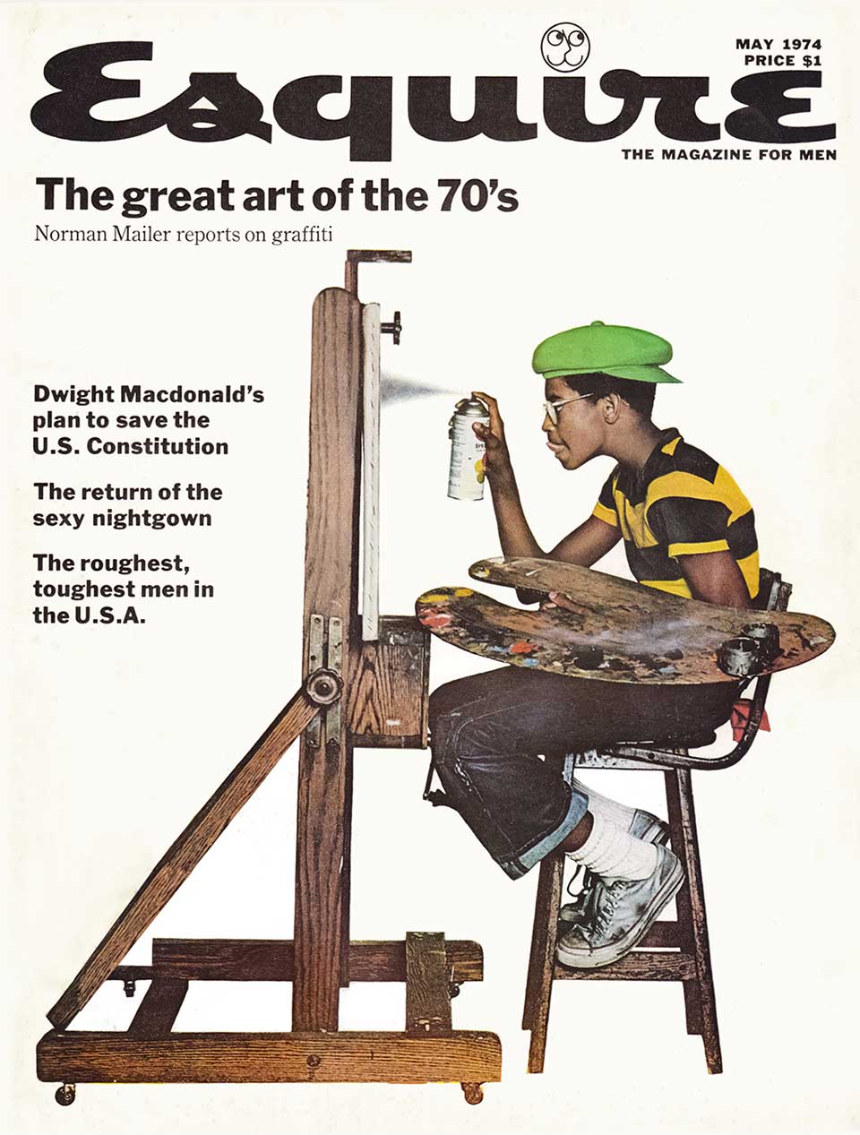
Esquire Magazine - May 1974
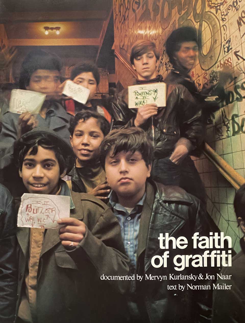
The Faith of Graffiti Book - 1974
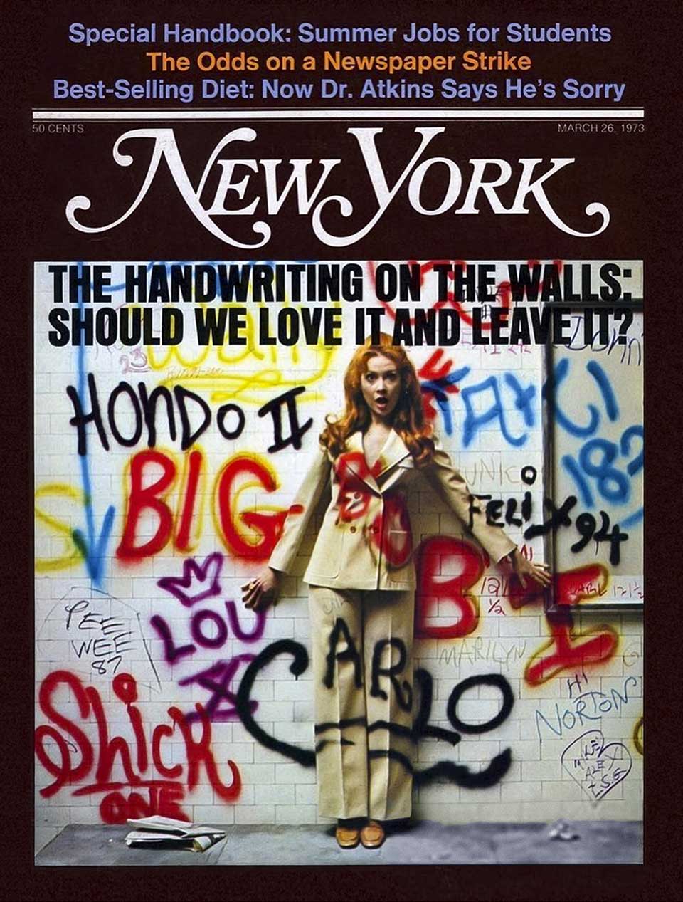
New York Magazine - March 1973
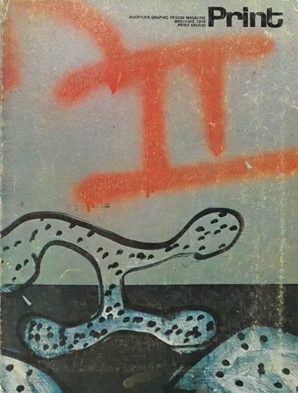
Print Magazine - May/June 1972
Graffiti appeared as the subject of media many, many times before it was used as an actual, visual tool of media. While the aesthetic of graffiti as a component of urban decay appeared frequently in film & print, it was often the aspect of vandalism and crime that was being utilized as opposed to the artwork or lettering. Even when graffiti was the primary subject, media rarely used the graffiti aesthetic in lettering, illustration, or design.
There are some very notable exceptions...
Graffiti Artwork & Lettering As Graphic Design
By the late 70s and early 80s, Hip-Hop was producing media, fashion & fine art of it's own. Graffiti visually defined and identified the culture. Its distinctive lettering and aesthetic was sought after to perform that specific visual task. While the graffiti phenomenon had a life of its own & origins that predate Hip-Hop culture, the two were inexorably linked. Graffiti is considered to be one of the four primary & original elements of Hip-Hop: Rap, DJing, Break Dancing & Graffiti. Being the only non-music-related element, graffiti continued to develop with or without Hip-Hop. While many writers consider themselves denizens of the underground subculture of Hip-Hop, many do not. It was, however, largely through Hip-Hop that graffiti art was able to build an industry around itself and survive the tides of shifting cultural & artistic trends and become the immutable factor in art & design that it is today.
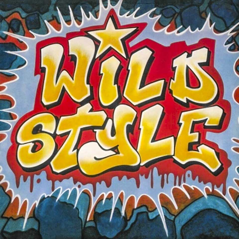
Wild Style Movie Soundtrack
12" LP Cover Art - 1983
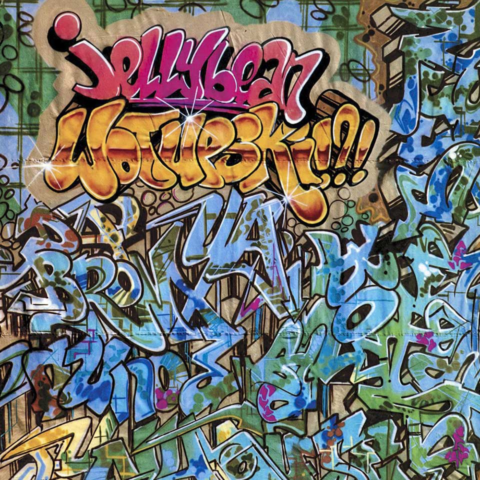
Jellybean Wotupski!?! - Electro Album
12" LP Cover Art - 1984
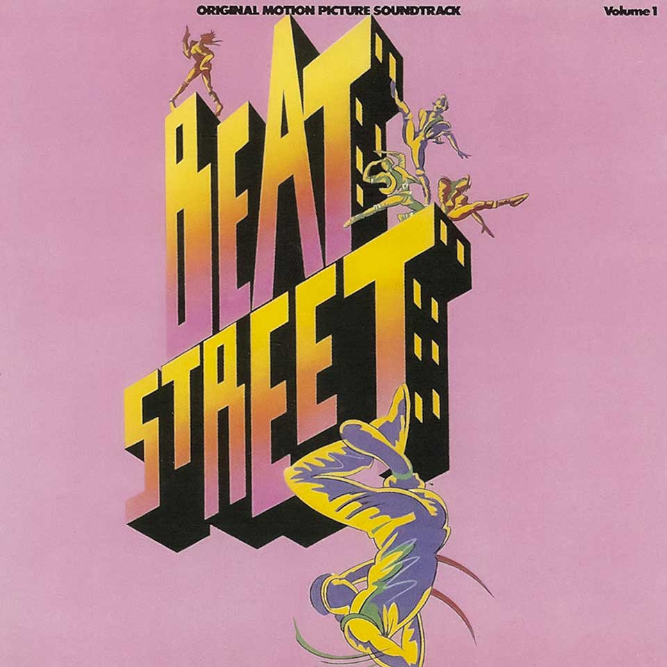
Beat Street
Movie Soundtrack Cover Art - 1984
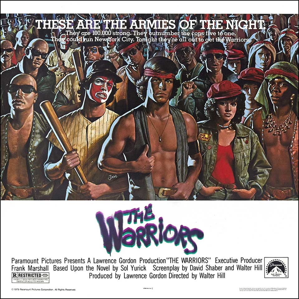
The Warriors Movie Poster
One of many variations - 1979
Wild Style Movie, Soundtrack & Mural - 1983
Shot in 1981, released in 1983, Wild Style is regarded as the first Hip-Hop motion picture. The original posters & promotional artwork for this film consist almost solely of Martha Cooper's photography of cast members posed in front of the iconic "Wild Style" mural that was painted by Zephyr & Revolt. The graffiti lettering in these photos does the work of both imagery & informational text, serving as the title. The artwork is used, on its own, without the accompaniment of the cast as the cover art for the 1983 Wild Style Movie Soundtrack. The 12" vinyl LP uses no additional text or imagery on the front cover, just a photo of the very legible & brightly colored mural. The Wild Style mural also appears in "Spraycan Art", the follow-up to the famous, 1984 "Subway Art" book. Countless homages & imitations of this mural have appeared in Hip-Hop culture and media over the decades since the Wild Style movie and the accompanying soundtrack were first released.
Jellybean Wotupski!?! - 12" Vinyl LP - EMI - 1984
A photo of very real graffiti lettering, painted by well known graffiti artists Seen & Duster occupies the entire front cover, doing the work of both text & imagery. Like the earlier Wild Style movie soundtrack, this 12" LP cover is covered entirely and solely by a cropped view of the "wild style" graffiti lettering with no accompanying typography. The artists name and the album name are up top, brighter, simpler, more legible, in hot colors while the names of the two graffiti artists which run vertically from bottom to top, on the right side, the phrase "Da Bronx", The crew name "UA" and several other words are rendered in cool colors, connecting, overlapping and running in different directions.
Beat Street Movie & Soundtrack - 1984
The Beat Street movie was many peoples introduction to Hip-Hop culture. Being much more mainstream & widely available, this movie was less obscure than the Wild Style film. Hip-Hop devotees of all sorts tend to love this movie for its reverent and realistic portrayal of all four elements. Like Wild Style, the Beat Street cast features a number of iconic figures from early Hip-Hop. The artwork for this movie is not exactly 'graffiti". It represents the application of the graffiti motif to 1980s graphic design. The block letters themselves are scaled and staggered reminiscent of graffiti treatments. The two-color fade fill and 3D with lighted windows like a cityscape further embed common graffiti elements. The art does not look like spray paint but it does look a bit like the work you might find in a writers blackbook. This art also captures the pen and ink, airbrush and film matte, transparencies and cameras... phase in graphic design that was, in itself, a style in the 80s. While Wild Style & Wotupski utilized, pure, real, unimpeded, unassisted graffiti artwork and lettering, the minimalist artwork for Beat Street merges graffiti and graphic design very successfully.
The Warriors Movie and Graffiti Logo
The Warriors is a cult classic. It's not a Hip-Hop movie but it was created during Hip-Hops formative years. This highly stylized film portrays New York street gangs and given the time and place of the filming, graffiti features prominently in many scenes. The tags of several real and prominent, early, NY graffiti writers can be seen in the film and one of the movies main characters "Rembrandt" is a writer. The spray paint text logo for the movie is iconic. The lettering is not stylized like a tag but has the very obvious and effective appearance of thickly and boldly applied spray paint. The uneven stroke widths, bleed and spread, the decorative arrangement and liberal distribution of lowercase and capital letters provide a high degree of realism. When seen in its original form, the title logo includes the element of overspray and varying opacity.
Graffiti Lettering Meets Type
In its natural environment, out on the streets and in the hidden spaces of our cities graffiti lettering is often completely illegible to the untrained eye. The heavy, abstract & sometimes complex stylization seems to defy the core function of text to communicate information. Even early graffiti writers initially dismissed the fanciful lettering of emerging wildstyles & elaborate tags as self defeating. This debate cuts to the core of graffiti lettering concepts & continues today. Largely due to these extreme stylistic liberties most graffiti style fonts function primarily as headline or display fonts. Many also function specifically and almost solely to emulate graffiti itself being far too illegible for use in traditional communication and far to abstract for use at small sizes.
For a graffiti writer, even of limited experience, embedded in the cultural scene(s) surrounding the art it's usually very easy to distinguish lettering created by an actual writer from lettering created by a non-writer in an attempt to emulate an authentic graffiti style. Contrary to much of popular opinion, even tags, the base level, simplest form of Graffit art are not ususally the sloppy scriblings they appear to be. Appearing to some to possess little rhyme or reason, tags are a largely under-appreciated art. They are, in fact, more often then not, highly disciplined, well practiced calligraphic works rendered with unforgiving tools that take time to master. These works contain not only levels of mastery recognizable to the trained eye but alo a wealth of regional, cultural & artistic tradition that, when absent betray the attempt to reach the audience, sometimes offending them instead.
It was this combination of righteuous indignation at the embarrasing faux graffiti lettering too-often seen in media & a genuine desire to see the culture expanded into new places & further validated that inspired the creation and in some cases, even the names of the very first, real graffiti style fonts.